← Work/Privy Blog Redesign
Privy Blog Redesign
[One line on what the blog is for Privy, and what the redesign changed about how it is read]




- Role
- Product Designer
- Timeline
- [Months, 2026]
- Team
- [Your collaborators]
- Skills
- Content DesignInformation ArchitecturePrototyping
At a glance
[The outcome in one sentence: what the redesign is, and what it does for Privy’s readers.]
Where it started
[What Privy’s blog is for, and what state it was in.]
[Privy, and what the blog carries for it: product announcements, case studies, engineering writing, the changelog. Who reads it, and what they come for.]
[The blog before the redesign: how posts were found, what the landing page did and didn’t do.]
What was broken
[What a reader couldn’t do on the old blog.]
[Evidence: how posts were reached, which were never found, what the landing page asked of a reader.]
[The reframe the team agreed to.]
How might we [make Privy’s writing easy to find, easy to read, and worth coming back to]?
What we learned
[The insights that set the landing page’s order.]
[Insight one: on the landing page]
[Why one featured post and a Latest column, before any gallery.]
[Insight two: on the post page]
[What a post needed at the top: the TL;DR, the at-a-glance stats, the contents.]
[Insight three, as a sentence]
[Source, then consequence.]
How it took shape
Two landing versions, one recommendation, and a post page rebuilt around the first screen.
The architecture
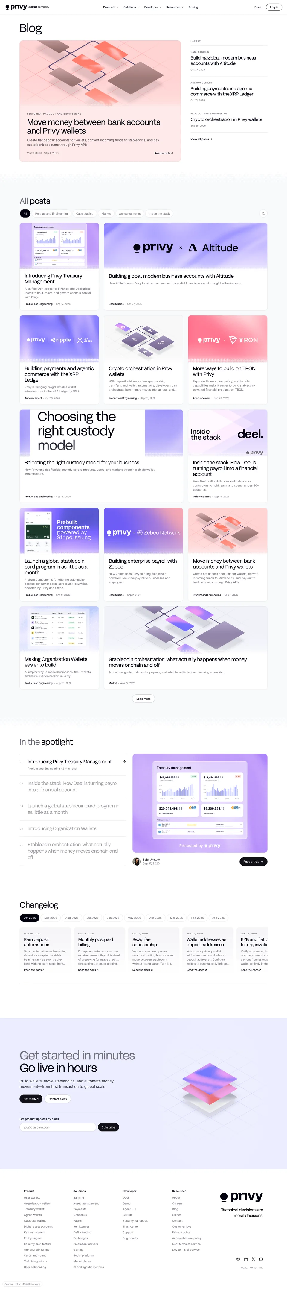
[The landing page’s order and why: the hero, the spotlight between the hero and the gallery, the gallery, the changelog, the call to action. What was cut, and the newsletter question.]
Version A and Version B
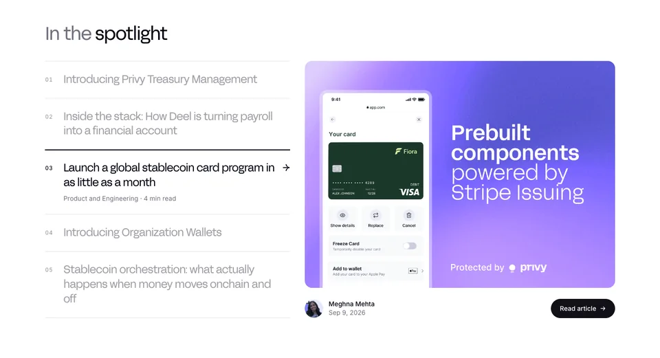
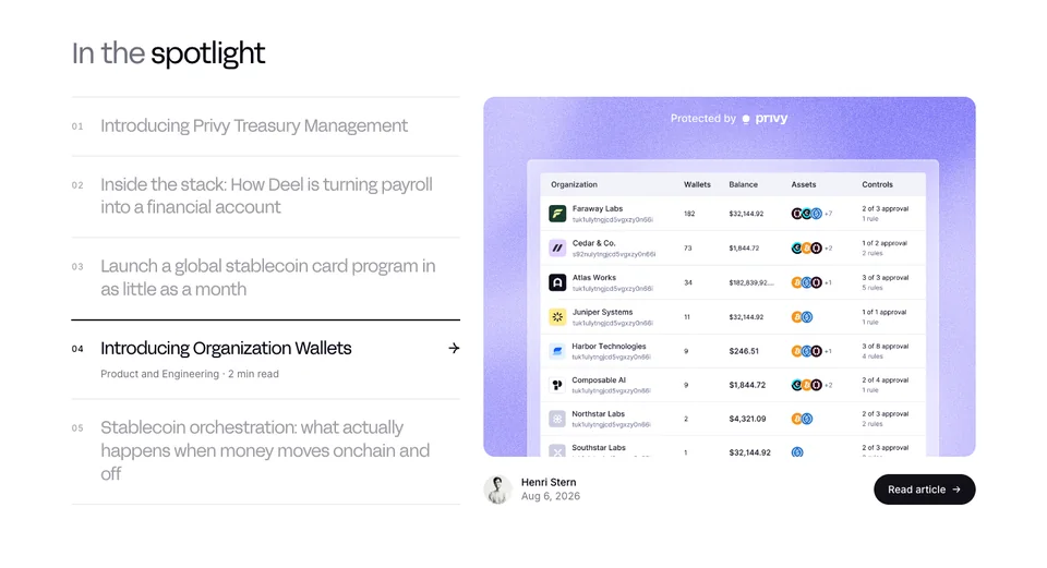
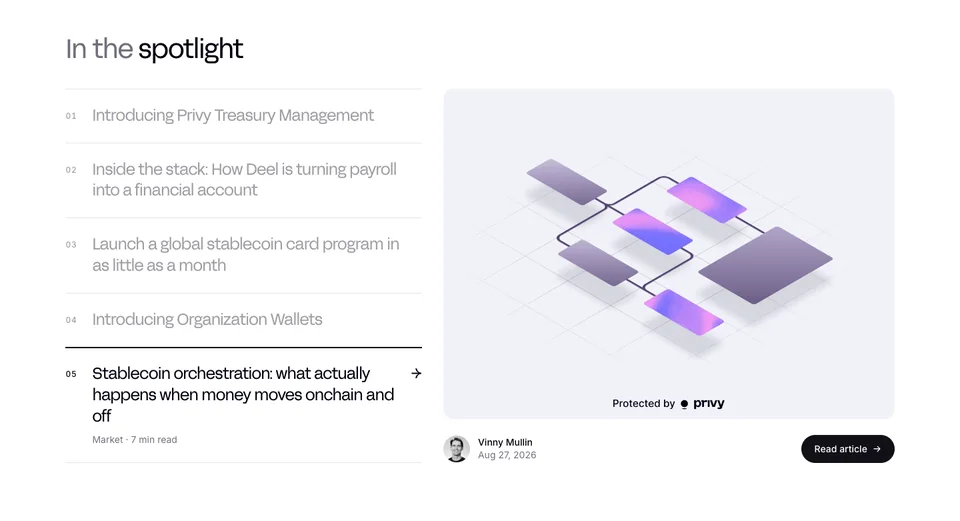
Two hi-fi versions went to Privy. Version A: a 3x2 gallery and a spotlight that grows to full screen as you scroll. Version B: a bento gallery and a static spotlight on the hero’s gradient card. [What each was testing, and why the deck recommended A.]
The post page
[The post page’s first screen: the TL;DR in its frame, the at-a-glance stats, the contents list, the pull quotes, Keep reading. How the body type was settled.]
What it became
[The blog, section by section, each with the reason it is there.]
One post, featured
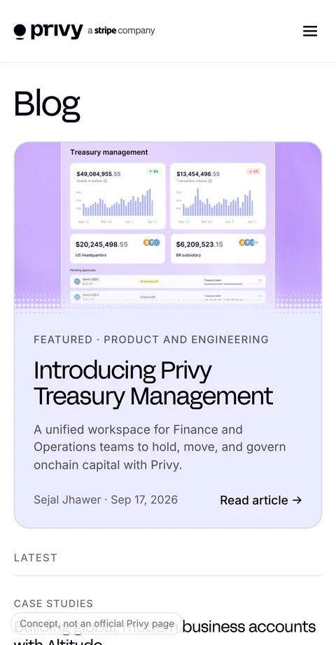
[Why the landing opens on a single post with its image, eyebrow, dek and byline, and a Latest column beside it.]
All posts, filterable
[The gallery, its category chips and search, and what the cards show.]
In the spotlight, and the changelog
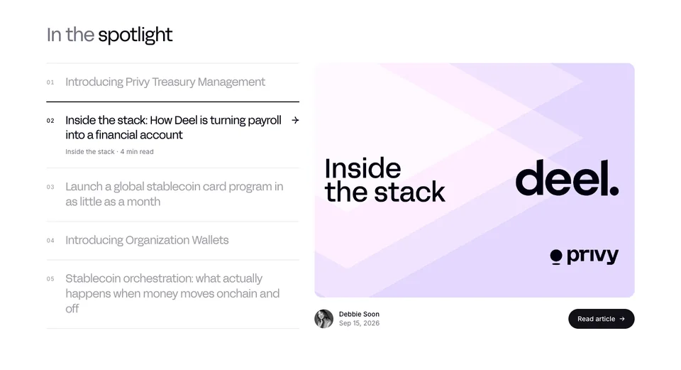
[What the spotlight index does, and why the changelog lives on the blog.]
A post you can read in a minute, or an hour
[The TL;DR, the stats, the contents, and the long read under them.]
How it landed
[Where the redesign stands, and what Privy said.]
- [—]
- [the metric that moved, or the decision made]
- [—]
- [the second]
[The response, the questions Privy had, and what shipped or is shipping.]
Looking back
If I did this differently…
[What you’d do sooner]
[The decision you’d make earlier, and what it cost to make it late.]
[What you’d test]
[The one thing you still don’t know about readers, and how you’d find out.]
[What you’d explore next]
[The adjacent problem this work opened up.]
More work